How I Learned to Stop Worrying and Love The Shell
by Ploum on 2011-03-16
So far, I’ve used GNOME-Shell for at least 10 minutes and Unity for at least 15. And it was six months ago. Just to tell you how much I’m competent on the subject. And I didn’t like them. Not at all. I’ve my own ideas about the desktop.

So what? What is the point about liking or not liking? You don’t like blue? Does it make blue a bad color? User interaction is an engineering science. You identify a problem, you design prototypes, you conduct experiments to choose which design has the best result (on a scale that you built as part of the experiment). The fact that you like a prototype more than another is not relevant.
What is our problem?
Learning how to use a computer takes a lot of time but is increasingly needed. Even with experience, some tasks needs too many steps to be accomplished or makes assumption about your hardware (you have a big screen, a mouse or a keyboard) which is not always the case any more. Sometimes, it is even required to know how a computer works to be able to use it (aka exposed implementation).
This is my personal formulation and I believe that the motivation behind GNOME-Shell or Unity was to address (at least partially) this complex problem.
What would be the perfect solution?
If you want to solve such a complex problem, you need a vision. The vision is what you would want if you had super power, an ideal. It is the perfect world. In the GNOME community, I’ve heard several mentions of this ideal: nothing.
Indeed, you don’t want a computer interface. You only want things to be done. A less perfect step would be a big red button marked with « Do what I want now! ». Now you understand why GNOME is trying hard to remove everything which is not needed. How to build a better user experience than having nothing?

Let’s dream an put this perfect solution on the top of a pyramid. We are currently building the floors, step by step, trying to reach the top one day[1].
Building user experience: the bottom-top approach.
You take your existing UI and you try to improve it gradually. Problems arise when people don’t explicitly agree about what should be the top of the pyramid. Worst: most people don’t even think about a top of any kind. They just focus on building the next level.
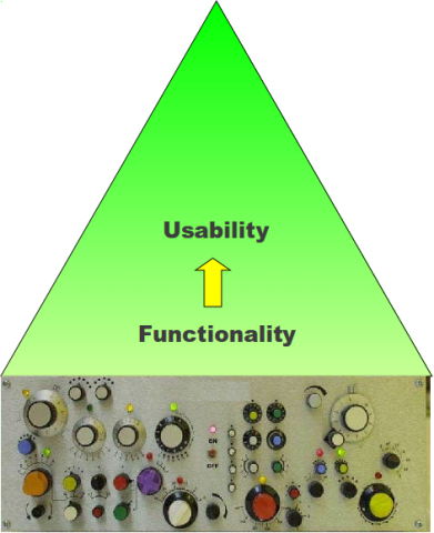
You were collaborating happily for a few layers then, suddenly, you disagree.
— « Building on the right is better for now! »
— « Yes, but if we want to reach the top on the left, we should work on the left. »
Sounds familiar, isn’t it?[2]
Building user experience: the top-bottom approach
In that kind of approach, you throw everything, take the ideal solution and downgrade it until it fits your constraints.
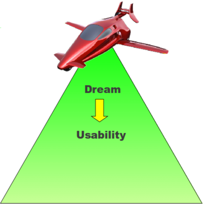
Which is exactly what the GNOME-Shell did even if, in my opinion, the communication about that process was often very poor or hidden behind lot of trendy buzz words/designer masturbation[3].
This approach has a major drawback: it breaks user habits and changes the culture. One typical example of a top-bottom designed UI is the Dvorak keyboard layout. By observing the number of Dvorak keyboards around you, you might understand the strength of habits and culture.
There were some recent controversies about GNOME-shell design. For example, they removed the « minimised » button. What I learned through experimentations[4] is that there’s no logical difference between closing an application and hiding it. The difference between closing and minimising is impossible to grasp without knowing how a computer is working and what a software instance is. Yes, we have to agree that this is a pure implementation mechanism revealed.
Another example? Shutdown, hibernate or sleep are exactly the same. In fact, the whole « boot » is an implementation detail. If there was no kernel upgrade/crashed process, reboot or shutdown would never happen at all.
Let me take one more example, not addressed by GNOME 3 yet. What is the difference between your GDM login screen and your gnome-screensaver lockscreen?
Answer: none. They have the same features, serve the same purpose. In fact, when I open my laptop or move the mouse, I want to see this screen. That’s all.
In the end
Until today, I didn’t like GNOME-Shell. It will break my habits. It doesn’t have something like the panflute applet[5], it doesn’t allow me to have fixed workspaces. But I will use it anyway. Because I believe that we sometimes need disruptive innovations. I took the time to learn the French Dvorak layout on a strange keyboard. Why not doing the same for GNOME-Shell? Take it or leave it: GNOME-Shell is not there to reimplement your old workflow. What would be the point of doing that anyway?

Without even installing it on my computer, I suddenly learned to stop worrying and love GNOME-Shell.
Pictures credits: The Mind’s Eye Photography, fat_albert9631.
Notes
[1] In that regard, I’m really enthusiastic about projects like Postler.
[2] Here, I removed four paragraphs analysing the current Unity/GNOME-Shell debate. You’ve read enough of this already.
[3] No offense intended. Just sharing my own perception
[4] Yes, I mean experimentation with a panel of different users, asking them to accomplish some task and observing their behaviour.
[5] Allowing me to quickly rate a song that is currently playing
About the author
I’m Ploum, a writer and an engineer. I like to explore how technology impacts society. You can subscribe by email or by rss. I value privacy and never share your adress.
I write science-fiction novels in French. For Bikepunk, my new post-apocalyptic-cyclist book, my publisher is looking for contacts in other countries to distribute it in languages other than French. If you can help, contact me!