The aristocratic desktop (part 3) : There’s no tray icon in GNOME!
by Ploum on 2009-08-05
Part 1 : Introduction
Part 2 : Home is Desktop
Part 3 : There’s no tray icon in GNOME
Part 4 : Kill The Double Click
Repeat after me one more time : there’s no such thing as a « tray icon » in GNOME. GNOME has a notification area which has nothing to do with the Windows-ish obscenity called « systray », this little space where any application can put a little icon.

I mean, seriously, have you ever think about how completely stupid is the idea of a « tray icon »? Can you imagine how black magic it should be for a new computer user?
The origin of the systray
Windows 95 came with a new concept called « taskbar » when you could have a list of opened windows, a start button and a notification area. Due to an historical misunderstanding, some people started to call the notification area by the name « systray ». This was wrong but this misconception might have helped to forget the original goal of the notification area.
As computer performances raised, people had more and more applications opened at the same time. Unfortunately, the taskbar list of opened windows was limited by the width of the screen. In the Unix-like world, the solution was found with virtual desktops. But there were no virtual desktops in Windows.
Developers then found a workaround : abusing the notification area and putting their application there instead of the list of opened windows because notification icons were smaller. It was clearly an abuse but it had many benefits for the developers. One of those was that the user would be less likely to close the application, unaware that it’s running. It allows the application to have more control on what the user is doing, to start faster, to continue to do some processing in the background. Remember : we are in a commercial world where each application want to be seen as much as possible by the user, using non-standard skins, splashscreens. We are in a world where we don’t want to help the user, we just want to be familiar to the user and to look completely different so it worth the price to spend.
With Windows XP, Microsoft acknowledged the abuse of the notification area and offered a function to « hide » some icons from the notification area. I find that really funny. I mean, imagine that you buy a brand new car and that some mysterious indicators started blinking everywhere on your dashboard. What would you think if the car maker, knowing the problem, offered you a pair of sunglasses with the next model of the car?

Anyway, this « feature » reinforced the idea that it was a « systray », something not well defined but where you could put icons if you wanted them to be smaller than in the tasklist.
The notification area of most Windows system is now fucked beyond any repair. I highly recommend the euthanasia of the whole thing.
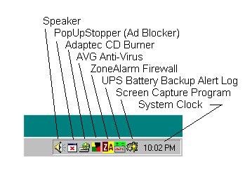
I’ve seen with my own eyes, a fresh OEM installation of Windows XP on a Toshiba laptop starting for the first time with 43 (forty-three!) icon in the « tray »… by default! The notification area was starting before the middle of the screen[1].
Torture your users, basic usability common sense is for sisies
At this point, you might think : « ok but what’s wrong with putting icon in the systray? ». The answer is in three words : consistency, logic and usability.
You might not realize it because you are using tray icons for years but there’s no logic behind the systray. Once a window is open, there’s absolutely *no* way of knowing what will be the result of the close button. Will it close the application, stoping its current work or will it just hide itself in the tray?

Even worst : the systray is sometimes called on close, sometimes on minimize. And when it’s on close, this is not trivial to really quit the application.
Using the notification area as a systray break the window manager !
So, only because you, application programmer, want your application to behave in your non-standard way, you break the usability of one key component of all your users! Yes, it is that bad : if your application use a tray icon by default, you are breaking completely the usability of your user’s desktop. Even if it’s only your application. It is proven that when beginner met an exception to the rule, they don’t trust the rule anymore, seeing once again the computer as a scary stuff without any kind of logic.
For beginners, it’s a nightmare. There’s no way to know what an application will do when you press close. There’s no intuition. Marie was quick to grasp the taskbar concept but she still doesn’t understand that some applications are not in the window list. I pointed her the notification area but she said to me that it was so tiny that she doesn’t want to understand it. Jean, on his side, is still fighting with the taskbar concept. He doesn’t understand the difference between closing and minimizing[2], I don’t believe I will be able to explain him the so-called « systray ».
On the other hand, application that behaves normally let the user choose to put them in the taskbar or on another desktop. User is put back in control! Yummy!
How to turn a lot of screen space into a scary pile of useless junk
So much for usability? Wait, there’s more. Using the notification area as a tray make it useless. When there’s more than 4 or 5 icons, the eyes simply don’t catch any new icon anymore. Finding the icon you want is slower which each icon you add. Of course, if your application was the only one to use the notification area as a tray, it would be fine. Unfortunately, it is not the case.
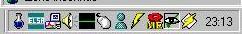
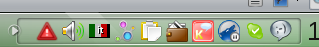
Just one real life example under GNOME:
– you are connected on a wifi : one icon (it can be seen as a notification)
– you are on battery : one icon (it’s an important notification)
– you have taskcoach started on another desktop : one icon (or just try gtg) – you start tomboy from the menu to see a note and don’t have it in your panel : one more icon
– you have lot of ram and want OpenOffice to start faster : one f*** completely useless icon
– you listen to music with rhythmbox which is on its own desktop and controlled through music-applet : nevertheless one icon more[3]
– you want to take regular breaks and use workrave with the applet. You still have this cute but useless icon.
– you are connected with Empathy on Jabber. You have no new messages but there is still one icon, redundant with the User Change applet.
This is a basic session that can be handled very well with a few virtual desktops [4]. You can see that there’s nothing fancy (it’s not far from my own default session) and that I only took icons that cannot be disabled (I disabled tracker for example). It means that, by default, the notification area is already 8 icons wide and only 2 of them are real notifications!

With 8 icons, you already take a lot of space on smaller resolutions like notebooks. It also means that there’s very few chances that the user see a 9th notification icon unless it’s blinking. And now the war to get user attention start : Ubuntu already abandoned the too crowded notification area to start the update manager automatically. According to user complaints…hem, feedbacks, this is one idea which is so bad that you can put it with the idea of using the notification area as a second taskbar. Bad ideas call bad ideas and, eventually, you end up with something as unusable as Windows XP.


Remember : it’s not because you are the developer of an application that you can choose what your users desktops will look like. You have to respect your users and the first thing is, by default, to behave like any other application. Your application is *not* special.
Good applications are applications we don’t even notice.
Yeah but it’s so easy for cross-desktop development
One argument that I often hear is « systray works also on KDE and XFCE, it’s easier than an applet. Applet are old and complicated ».
I agree with the statement above but I have two questions :
1) Do you really need that icon? It’s not because it’s easy to do that you have to do it. It looks like all new application quickly gain a tray icon only because it’s cool.
2) Do you really believe that because our underlying implementation sucks, we have to decrease usability, user experience and perceived quality of our desktop?
Do you really believe that user should pay the hard price for our laziness?
Daddy, where were you when they completely killed the notification area?
If we don’t do anything, we will end in a few years/months with a default 43 icons wide notification area. Fortunately, there’s hope, you can too correct your own application or report bugs against misbehaviour in your favourites applications.
I know that you are so used to this systray behaviour that we cannot just get rid of it. We also have to respect historical power users. So, what should we do?

1) By default, no application should have a permanent place in the notification area. If you still want to have this behaviour, make it a plugin or an option.

2) By default, your application should close on close and minimize on minimize. It makes sense, isn’t it? Hiding in the tray cannot be a default behaviour in any circumstances. There’s of course nothing wrong to have it as an option as it’s then the user choice, not the developer’s one.
3) Think twice before having an icon in the notification area. Kill useless icon (like openoffice starter). And rethink twice about adding that icon.
4) The icon should indicate an event or something new in your system. Pidgin and Specto already allow you to have this behaviour. They don’t show in your notification area unless there’s something you should check. You cannot believe how good it is to see the pidgin icon only when I have a message. I also rarely miss a message, which was not the case previously and, because it’s not blinking, I can choose to ignore it for some time if I want to. More freedom and power to the user = win[5].
5) If I have the applet, shouldn’t be obvious that I don’t want the icon in the notification area?
Not too hard too do, isn’t it? So, let’s make the desktop more usable, one icon at a time. Yes, I like the smell of burned systray in the morning!
Part 1 : Introduction
Part 2 : Home is Desktop
Part 3 : There’s no tray icon in GNOME !
Part 4 : Kill The Double Click
Notes
[1] I should have taken a screenshot, I’m sure you don’t believe me
[2] I will talk about that another time
[3] should be solved in the next release, yeah, thanks rhythmbox developers!
[4] Maries seems to like Virtual Desktops a lot, she asked me how to increase the number up to 6
[5] that feature alone is the reason why I can’t use Empathy at all
About the author
I’m Ploum, a writer and an engineer. I like to explore how technology impacts society. You can subscribe by email or by rss. I value privacy and never share your adress.
I write science-fiction novels in French. For Bikepunk, my new post-apocalyptic-cyclist book, my publisher is looking for contacts in other countries to distribute it in languages other than French. If you can help, contact me!